Graphical User Interface (GUI)
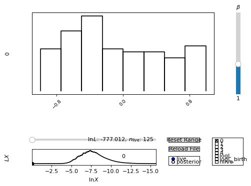
For an interactive view of a nested sampling run, you can use the anesthetic GUI by running the follwing in your console:
$ anesthetic <nested/samples/file/root>
Replace the <nested/samples/file/root> with the correct path and file root
of your nested sampling run (e.g. try it out with the anesthetic example data
in anesthetic/tests/example_data/pc). This will launch a new window
looking somewhat like this:

Warning
Note that the GUI only works out-of-the-box if your files follow a specific structure, matching either the one from PolyChord, MultiNest, or from UltraNest.
Note
However, you can also manually feed in your data and launch the GUI as demonstrated in the following example:
import numpy as np
import matplotlib.pyplot as plt
from anesthetic import NestedSamples

# Set up `data`, `logL`, and `logL_birth`
file_path = "../../tests/example_data/pc_dead-birth.txt"
file_data = np.loadtxt(file_path)
data, logL, logL_birth = np.split(file_data, [-2, -1], axis=1)

samples = NestedSamples(data=data, logL=logL, logL_birth=logL_birth)
samples.gui()
plt.show()
To make this example work with the anesthetic example data, place the above
code snippet into a python script (let’s call it
my_anesthetic_gui_script.py), make sure the file path correctly points
to the example data in the anesthetic/tests/ folder, and launch it from
the command line:
$ python my_anesthetic_gui_script.py
To modify the above example for your own case, you only need to change the
middle block to read in your data file(s) instead of the anesthetic example
data and pass on the data, logL, and logL_birth arrays, which
contain the parameter samples, their corresponding log-likelihood values, and
the log-likelihood values of their birth contours, respectively.
Note
If you are using a jupyter notebook, you should use
%matplotlib interactive magic command (or equivalent) to use the
interactive GUI.