Plotting
You can download the example data used in this documentation from the anesthetic GitHub page: | https://github.com/handley-lab/anesthetic/tree/master/tests/example_data
You will have the data automatically if you git clone anesthetic:
git clone https://github.com/handley-lab/anesthetic.git
Alternatively you can use your own chains files or generate new random data.
Import anesthetic and load the samples:
from anesthetic import read_chains, make_1d_axes, make_2d_axes
samples = read_chains("../../tests/example_data/pc")
Marginalised posterior plotting
To make marginalised posterior plots we recommend a similar routine to matplotlib, with a first line setting up the figure and axes to draw on:
fig, ax = plt.subplots(**kwargs)in matplotlib,
fig, axes = make_1d_axes(params, **kwargs)in anesthetic,
and then subsequent lines drawing on the axes:
ax.plot(x, y, **kwargs)in matplotlib,
samples.plot_1d(axes, **kwargs)in anesthetic.
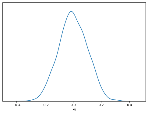
We have plotting tools for 1D plots …
samples.plot_1d('x0')
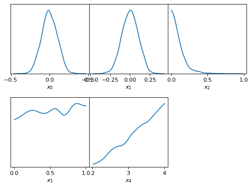
… multiple 1D plots …
samples.plot_1d(['x0', 'x1', 'x2', 'x3', 'x4'])
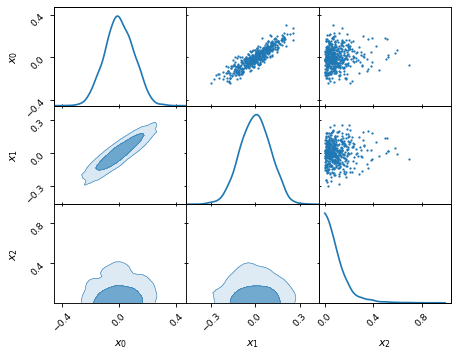
… triangle plots …
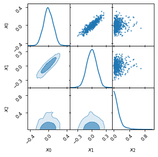
samples.plot_2d(['x0', 'x1', 'x2'], kinds='kde')
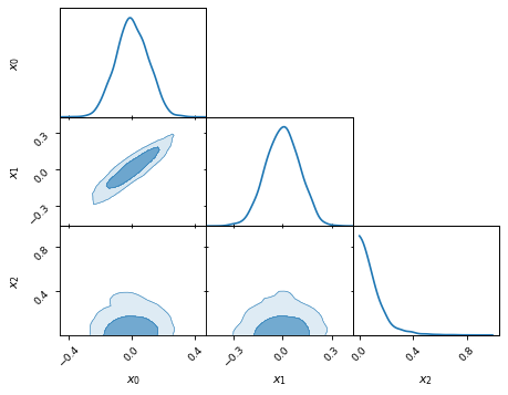
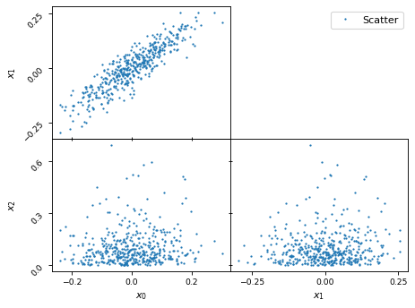
… triangle plots (with the equivalent scatter plot filling up the left hand side) …
samples.plot_2d(['x0', 'x1', 'x2'])
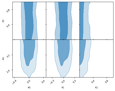
… and rectangle plots.
samples.plot_2d([['x0', 'x1', 'x2'], ['x3', 'x4']])
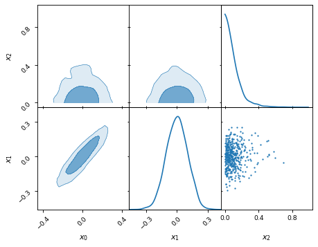
Rectangle plots are pretty flexible with what they can do.
samples.plot_2d([['x0', 'x1', 'x2'], ['x2', 'x1']])
Plotting kinds: KDE, histogram, and more
Anesthetic allows for different plotting kinds, which can be specified through
the kind (or kinds) keyword. The currently implemented plotting kinds are
kernel density estimation (KDE) plots ('kde_1d' and 'kde_2d'), histograms
('hist_1d' and 'hist_2d'), and scatter plots ('scatter_2d').
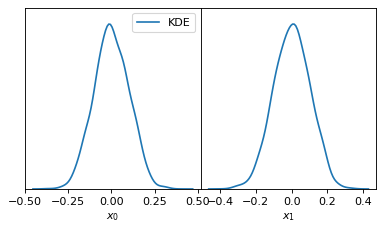
KDE
The KDE plots make use of scipy.stats.gaussian_kde, whose keyword argument
bw_method is forwarded on.
fig, axes = make_1d_axes(['x0', 'x1'], figsize=(5, 3))
samples.plot_1d(axes, kind='kde_1d', label="KDE")
axes.iloc[0].legend(loc='upper right', bbox_to_anchor=(1, 1))
fig, axes = make_2d_axes(['x0', 'x1', 'x2'], upper=False)
samples.plot_2d(axes, kinds=dict(diagonal='kde_1d', lower='kde_2d'), label="KDE")
axes.iloc[-1, 0].legend(loc='upper right', bbox_to_anchor=(len(axes), len(axes)))
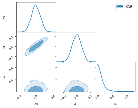
By default, the two-dimensional plots draw the 68 and 95 percent levels as
shown above. Different levels can be requested via the levels keyword:
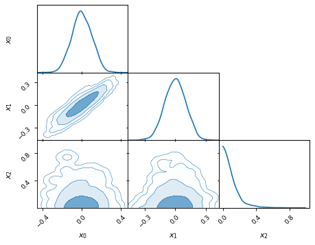
fig, axes = make_2d_axes(['x0', 'x1', 'x2'], upper=False)
samples.plot_2d(axes, kinds='kde', levels=[0.99994, 0.99730, 0.95450, 0.68269])
Histograms
The histograms make use of matplotlib.axes.Axes.hist() with all
keywords piped through.
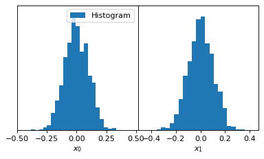
fig, axes = make_1d_axes(['x0', 'x1'], figsize=(5, 3))
samples.plot_1d(axes, kind='hist_1d', label="Histogram")
axes.iloc[0].legend(loc='upper right', bbox_to_anchor=(1, 1))
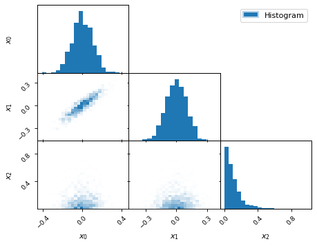
fig, axes = make_2d_axes(['x0', 'x1', 'x2'], upper=False)
samples.plot_2d(axes, kinds=dict(diagonal='hist_1d', lower='hist_2d'),
                lower_kwargs=dict(bins=30),
                diagonal_kwargs=dict(bins=20),
                label="Histogram")
axes.iloc[-1, 0].legend(loc='upper right', bbox_to_anchor=(len(axes), len(axes)))
Scatter plot
fig, axes = make_2d_axes(['x0', 'x1', 'x2'], diagonal=False, upper=False)
samples.plot_2d(axes, kinds=dict(lower='scatter_2d'), label="Scatter")
axes.iloc[-1, 0].legend(loc='upper right', bbox_to_anchor=(len(axes), len(axes)))
More fine grained control
It is possible to have different kinds of plots in the lower/upper triangle or
on the diagonal. To achieve this you can pass only a slice of the axes
(which is of type anesthetic.plot.AxesDataFrame) to the plot_2d
command. It is important, however, that the slice remains two-dimensional, e.g.
passing axes.iloc[0, 0] does not work, instead you should pass
axes.iloc[0:1, 0:1] (to ensure it is still of type
anesthetic.plot.AxesDataFrame).
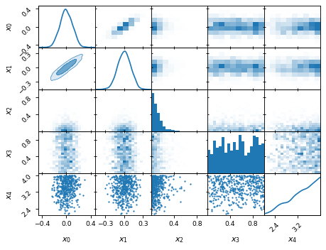
fig, axes = make_2d_axes(['x0', 'x1', 'x2', 'x3', 'x4'])
samples.plot_2d(axes.iloc[0:2], kinds=dict(diagonal='kde_1d',  lower='kde_2d',     upper='hist_2d'))
samples.plot_2d(axes.iloc[2:4], kinds=dict(diagonal='hist_1d', lower='hist_2d',    upper='hist_2d'), bins=20)
samples.plot_2d(axes.iloc[4: ], kinds=dict(diagonal='kde_1d',  lower='scatter_2d', upper='scatter_2d'))
Vertical lines or truth values
The anesthetic.plot.AxesDataFrame class has three convenience methods
scatter, axlines, and axspans, which help highlight specific points
or areas in parameter space across all subplots.
anesthetic.plot.AxesDataFrame.scatter() is for example particularly
useful when pointing out the input “truth” from simulations or the best-fit
parameter set of an MCMC run.
anesthetic.plot.AxesDataFrame.axlines() is particularly useful when
wanting to separate the parameter space in two. A cosmological example could be
the separation into closed and open universes along the line where the spatial
curvature is zero.
anesthetic.plot.AxesDataFrame.axlines() is particularly useful when
wanting to highlight a range of a parameter across the full parameter space,
e.g. the range of sensitivity of an instrument.
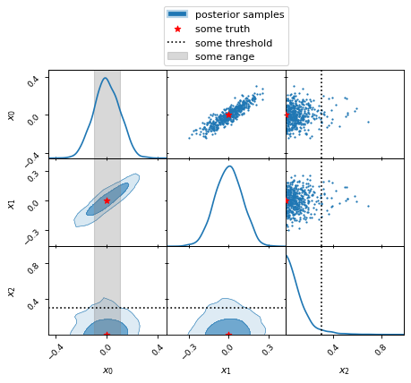
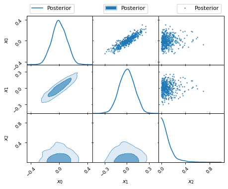
fig, axes = make_2d_axes(['x0', 'x1', 'x2'])
samples.plot_2d(axes, label="posterior samples")
axes.scatter({'x0': 0, 'x1': 0, 'x2': 0}, marker='*', c='r', label="some truth")
axes.axlines({'x2': 0.3}, ls=':', c='k', label="some threshold")
axes.axspans({'x0': (-0.1, 0.1)}, c='0.5', alpha=0.3, upper=False, label="some range")
axes.iloc[-1,  0].legend(loc='lower center', bbox_to_anchor=(len(axes)/2, len(axes)))
Changing the appearance
Anesthetic tries to follow matplotlib conventions as much as possible, so most changes to the appearance should be relatively straight forward for those familiar with matplotlib. In the following we present some examples, which we think might be useful. Are you wishing for an example that is missing here? Please feel free to raise an issue on the anesthetic GitHub page:
https://github.com/handley-lab/anesthetic/issues.
Colour
There are multiple options when it comes to specifying colours. The simplest is
by providing the color (or short c) keyword argument. For some other
plotting kinds it might be desirable to distinguish between facecolor and
edgecolor (or short fc and ec), e.g. for unfilled contours (see also
below “Unfilled contours”). Yet in other cases you might prefer specifying a
matplotlib colormap through the cmap keyword.
fig, axes = make_2d_axes(['x0', 'x1', 'x2'])
samples.plot_2d(axes.iloc[0:1, :], kinds=dict(diagonal='kde_1d', lower='kde_2d', upper='kde_2d'), c='r')
samples.plot_2d(axes.iloc[1:2, :], kinds=dict(diagonal='kde_1d', lower='kde_2d', upper='kde_2d'), fc='C0', ec='C1')
samples.plot_2d(axes.iloc[2:3, :], kinds=dict(diagonal='kde_1d', lower='kde_2d', upper='kde_2d'), cmap=plt.cm.viridis_r, levels=[0.99994, 0.997, 0.954, 0.683])
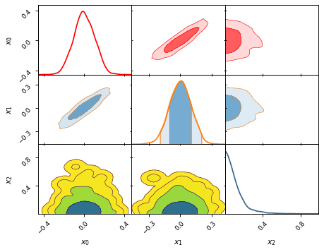
Figure size
fig, axes = make_2d_axes(['x0', 'x1', 'x2'], figsize=(4, 4))
samples.plot_2d(axes)
Legends
The easiest way of working with legends in anesthetic is probably by picking
your favourite subplot and calling the matplotlib.axes.Axes.legend()
method from there, directing it to the correct position with the loc and
bbox_to_anchor keywords:
fig, axes = make_2d_axes(['x0', 'x1', 'x2'])
samples.plot_2d(axes, label='Posterior')
axes.iloc[ 0,  0].legend(loc='lower left',   bbox_to_anchor=(0, 1))
axes.iloc[ 0, -1].legend(loc='lower right',  bbox_to_anchor=(1, 1))
axes.iloc[-1,  0].legend(loc='lower center', bbox_to_anchor=(len(axes)/2, len(axes)))
Log-scale
You can plot selected parameters on a log-scale by passing a list of those
parameters under the keyword logx to anesthetic.plot.make_1d_axes()
or anesthetic.samples.Samples.plot_1d(), and under the keywords logx
and logy to anesthetic.plot.make_2d_axes() or
anesthetic.samples.Samples.plot_2d():
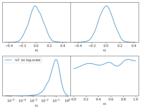
fig, axes = make_1d_axes(['x0', 'x1', 'x2', 'x3'], logx=['x2'])
samples.plot_1d(axes, label="'x2' on log-scale")
axes['x2'].legend()
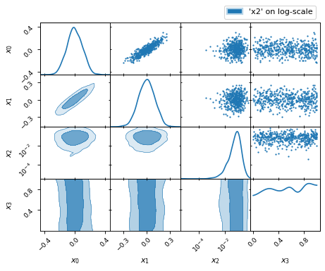
fig, axes = make_2d_axes(['x0', 'x1', 'x2', 'x3'], logx=['x2'], logy=['x2'])
samples.plot_2d(axes, label="'x2' on log-scale")
axes.iloc[-1, 0].legend(bbox_to_anchor=(len(axes), len(axes)), loc='lower right')
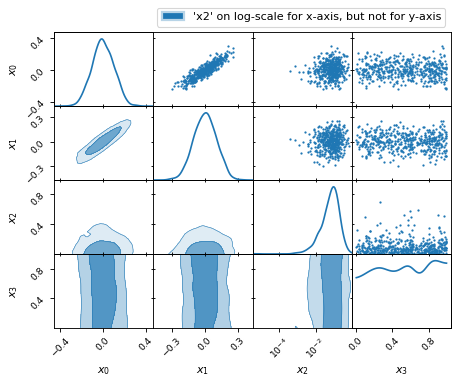
fig, axes = make_2d_axes(['x0', 'x1', 'x2', 'x3'], logx=['x2'])
samples.plot_2d(axes, label="'x2' on log-scale for x-axis, but not for y-axis")
axes.iloc[-1, 0].legend(bbox_to_anchor=(len(axes), len(axes)), loc='lower right')
Ticks
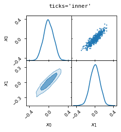
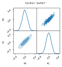
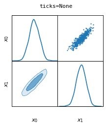
You can pass the keyword ticks to anesthetic.plot.make_2d_axes(): to
adjust the tick settings of the 2D axes. There are three options:
ticks='inner'ticks='outer'ticks=None
fig, axes = make_2d_axes(['x0', 'x1'], figsize=(3, 3), ticks='inner')
samples.plot_2d(axes)
fig.suptitle("ticks='inner'", fontproperties=dict(family='monospace'))

fig, axes = make_2d_axes(['x0', 'x1'], figsize=(3, 3), ticks='outer')
samples.plot_2d(axes)
fig.suptitle("ticks='outer'", fontproperties=dict(family='monospace'))

fig, axes = make_2d_axes(['x0', 'x1'], figsize=(3, 3), ticks=None)
samples.plot_2d(axes)
fig.suptitle("ticks=None", fontproperties=dict(family='monospace'))
Further tick customisation can be done by calling the methods
anesthetic.plot.AxesSeries.tick_params() or
anesthetic.plot.AxesDataFrame.tick_params() on the axes instance,
which will broadcast the corresponding matplotlib.axes.Axes.tick_params()
method across all sub-axes.
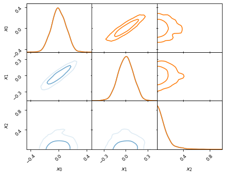
Unfilled contours
You can get unfilled contours by setting the facecolor (or fc) keyword
to one of None or 'None'. By default this will then cause the lines to
be plotted in the colours that otherwise the faces would have been coloured in.
If you would prefer the same colour for all level lines, you can enforce that
by explicitly providing the keyword edgecolor (or ec):
fig, axes = make_2d_axes(['x0', 'x1', 'x2'])
samples.plot_2d(axes, kinds=dict(diagonal='kde_1d', lower='kde_2d'), fc=None, c='C0')
samples.plot_2d(axes, kinds=dict(diagonal='kde_1d', upper='kde_2d'), fc=None, ec='C1')